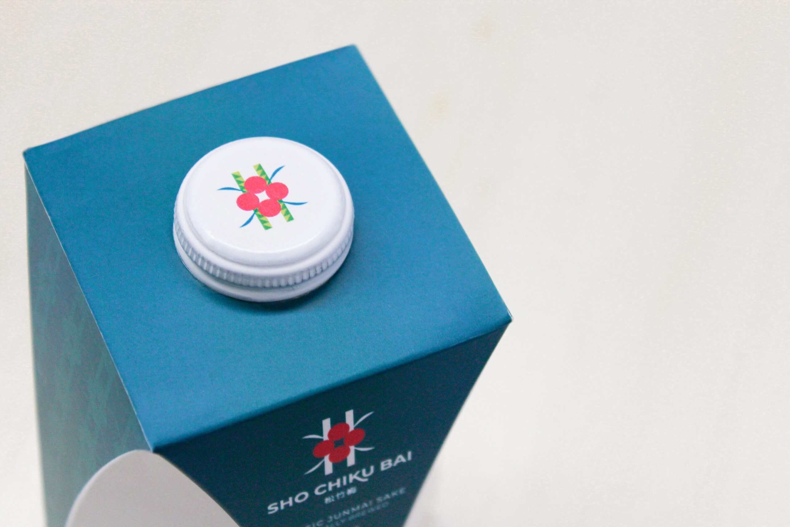
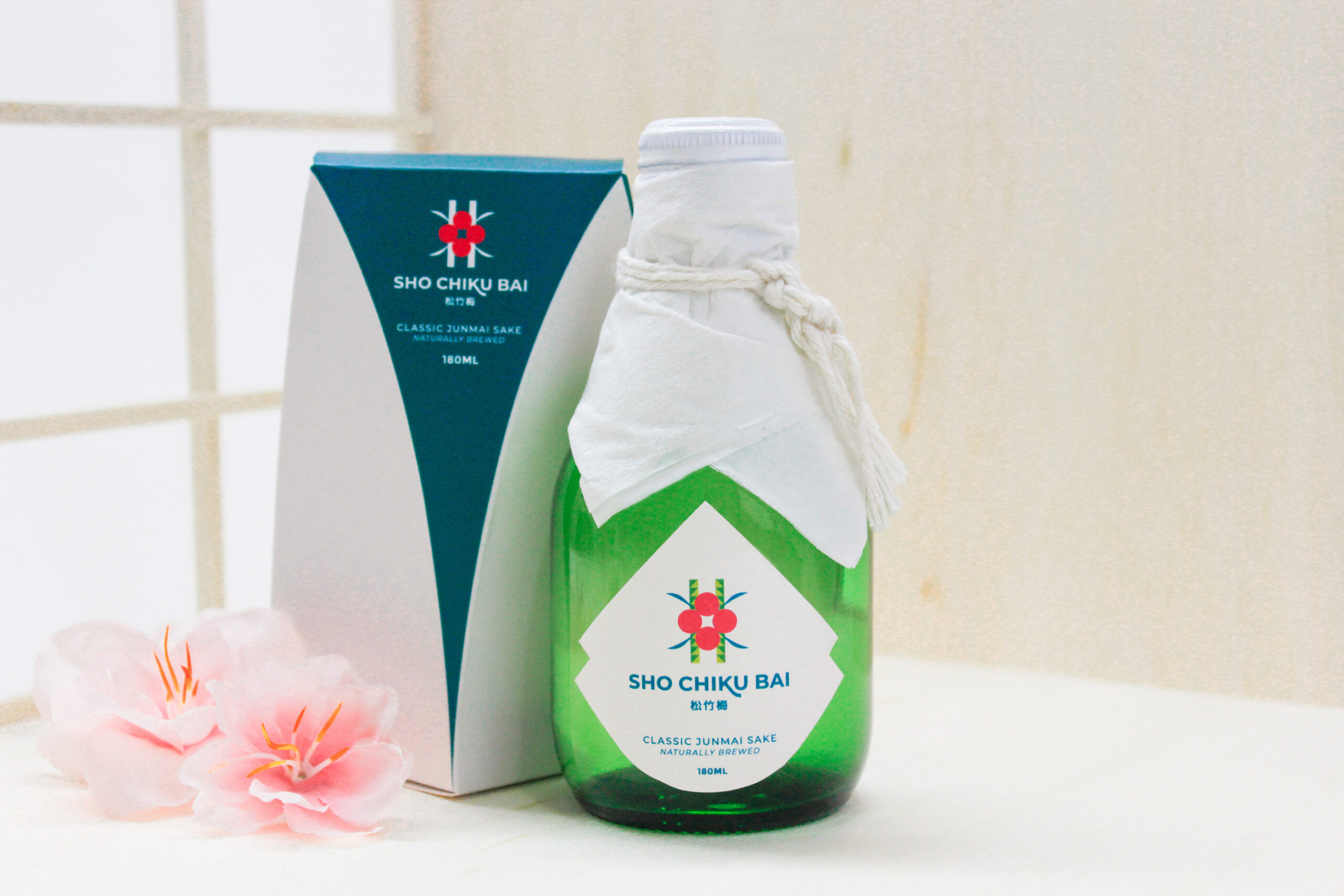
▸ Brief Refresh its visual identity by making a perception of luxury and delicacy coherent, as it is one of the most emblematic brands in the liquor business internationally.
▸ Solution Strategic planning encompassed a new label and packaging presentation, to encompass a much more exclusive user experience.
Design → Minoru Higa
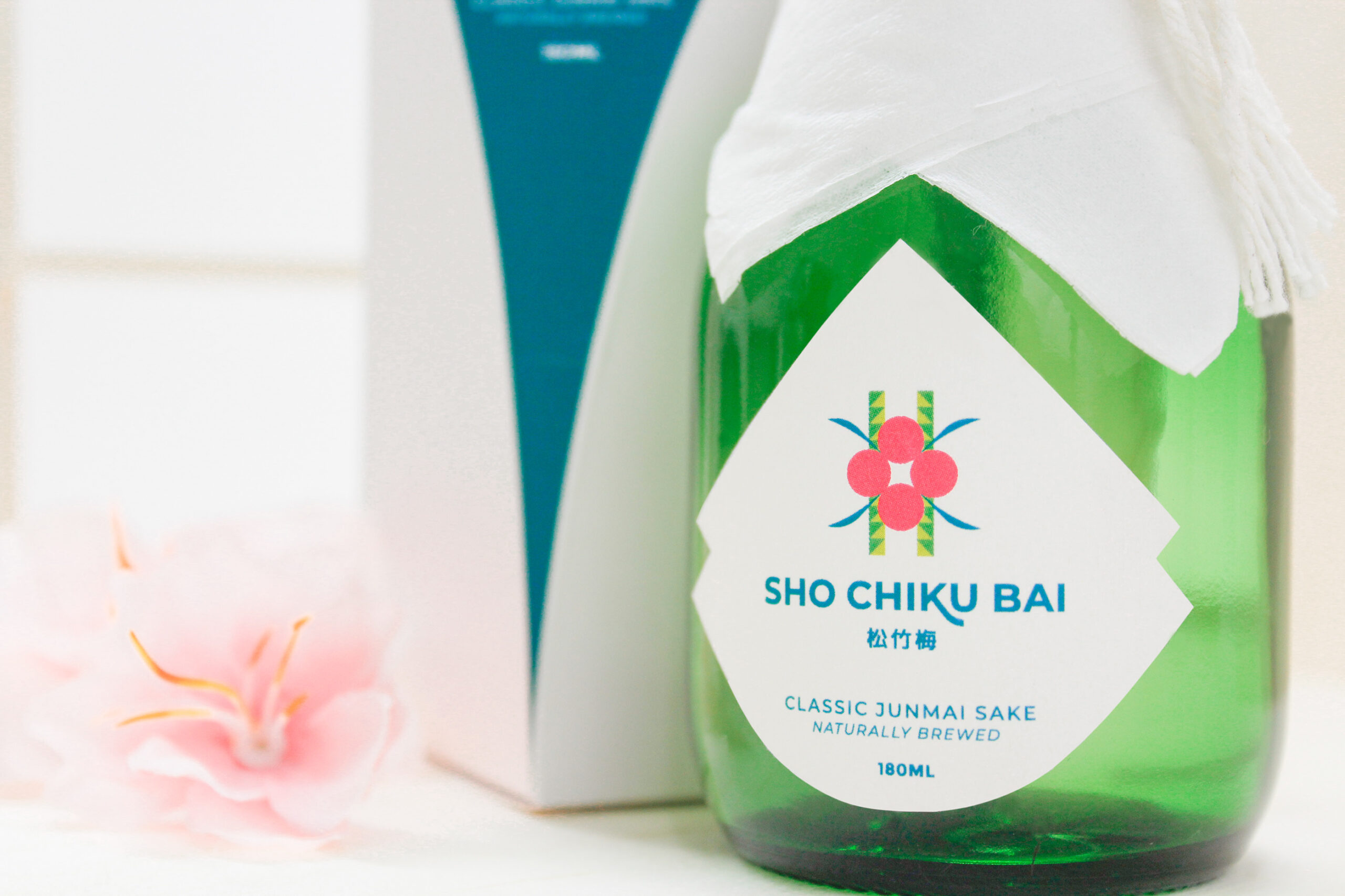
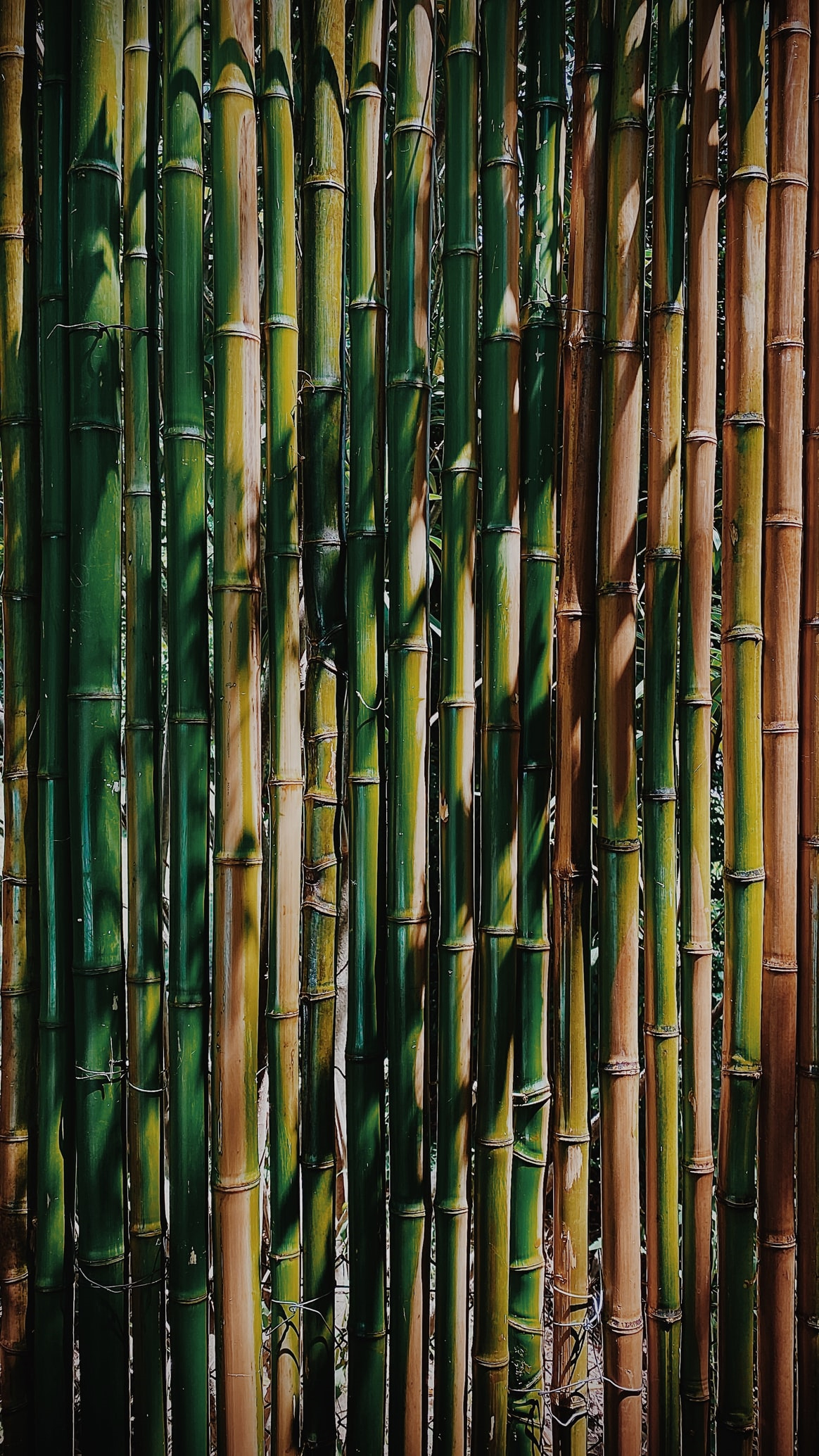
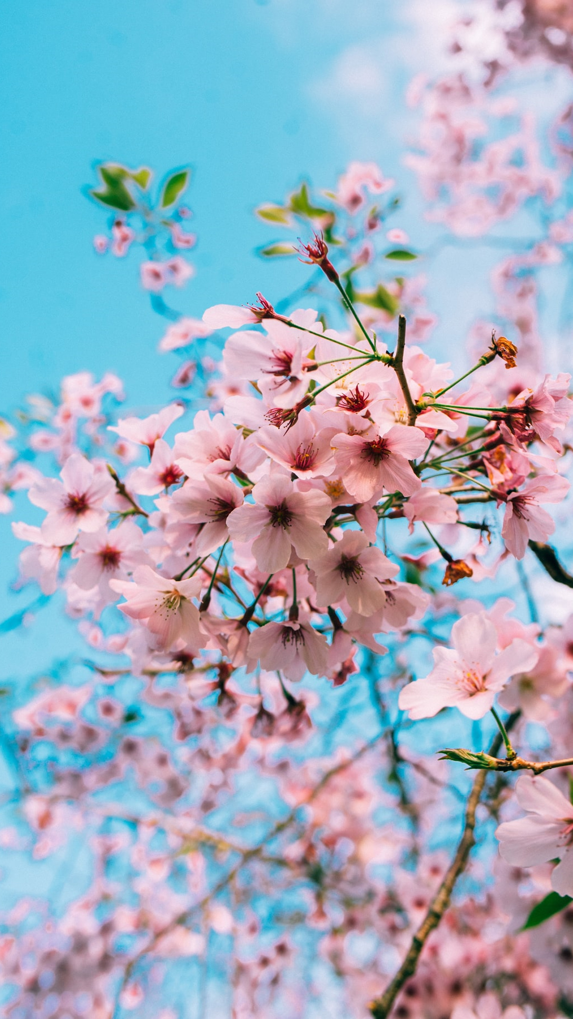
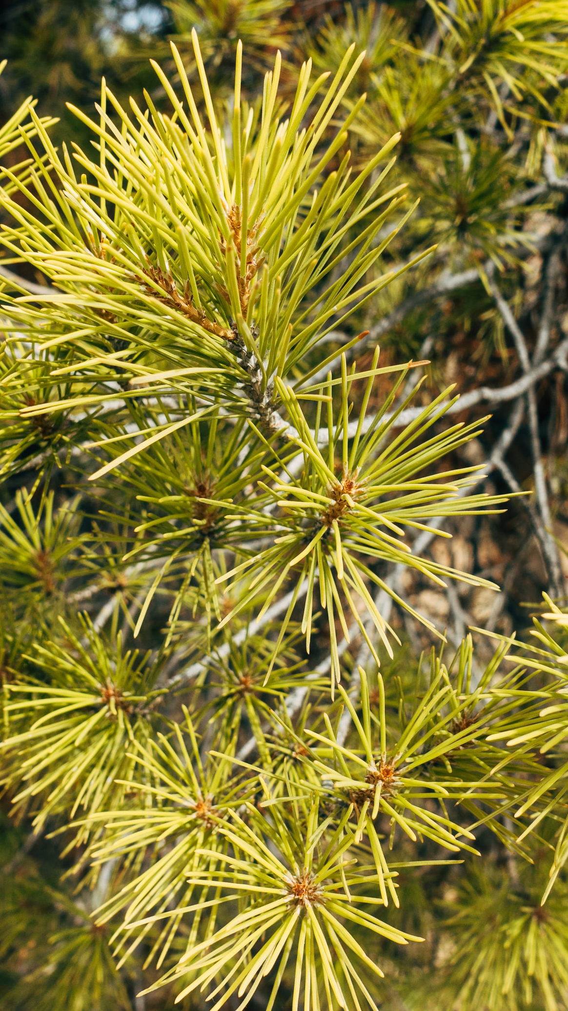
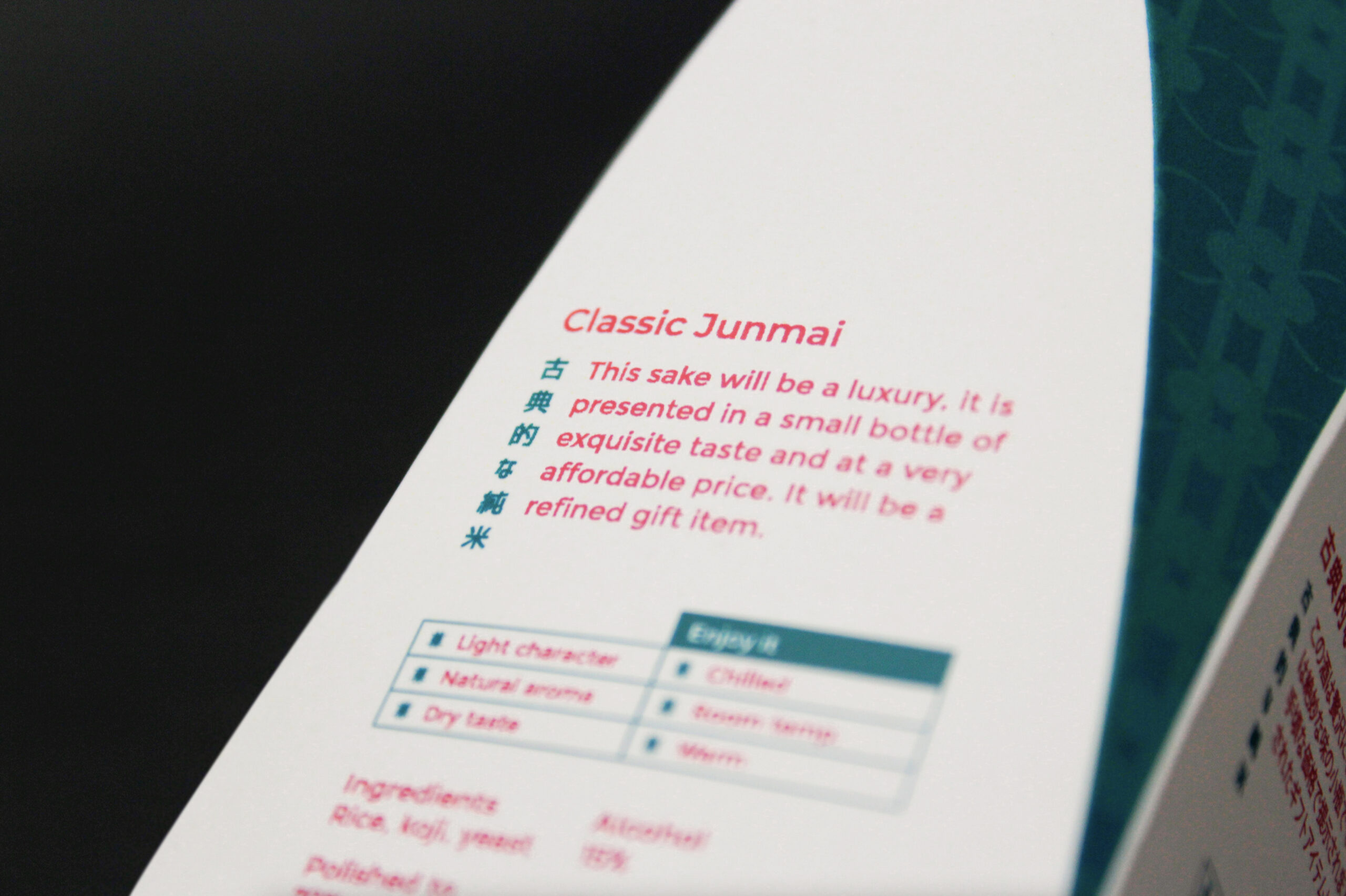
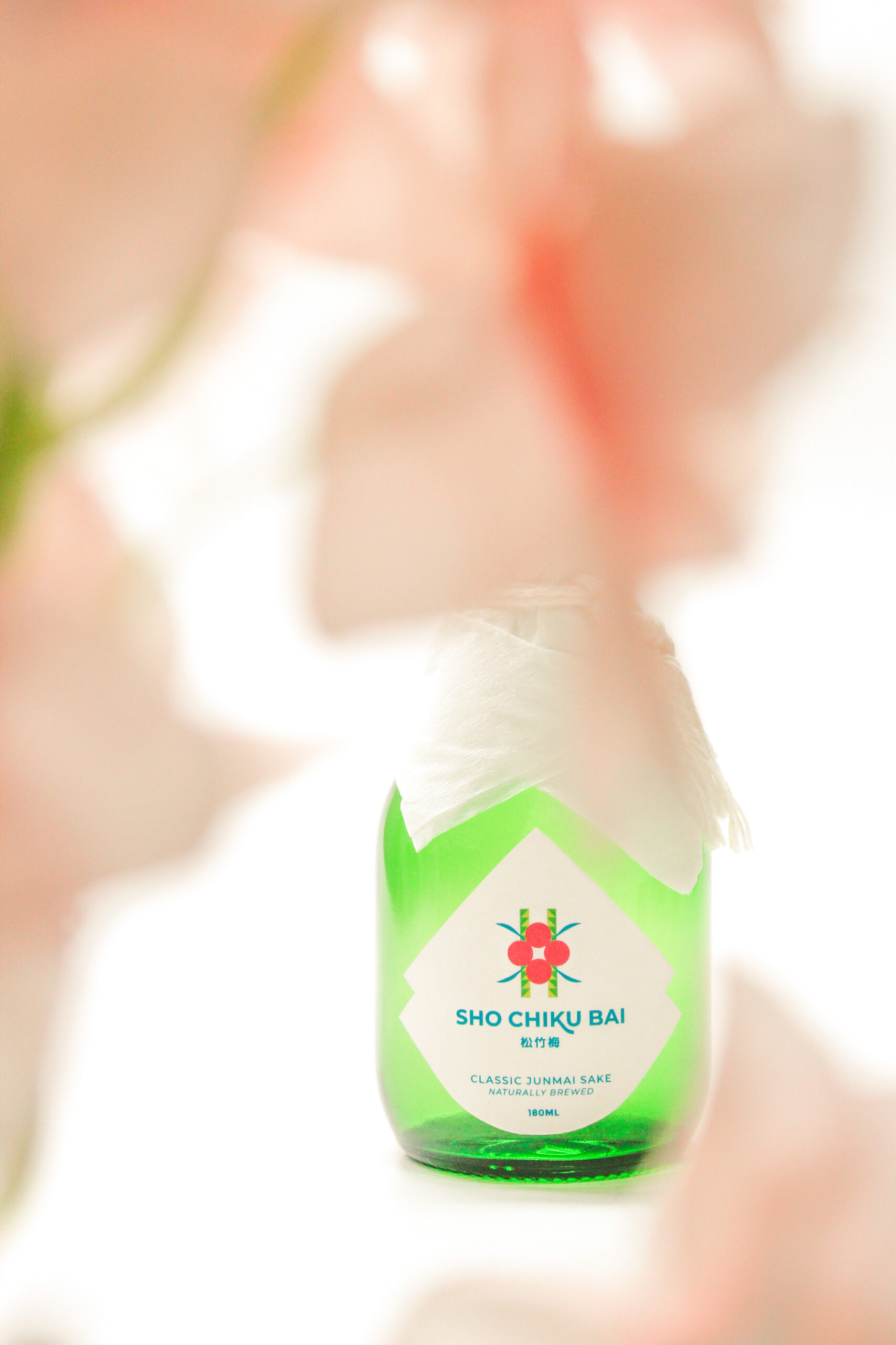
The name Sho Chiku Bai, in order, means: Pine, Bamboo and Cherry Blossom.
Natural symbols par excellence in Japan. The new isotype brings these elements
together in representation of the union to celebrate.
Historia y legado
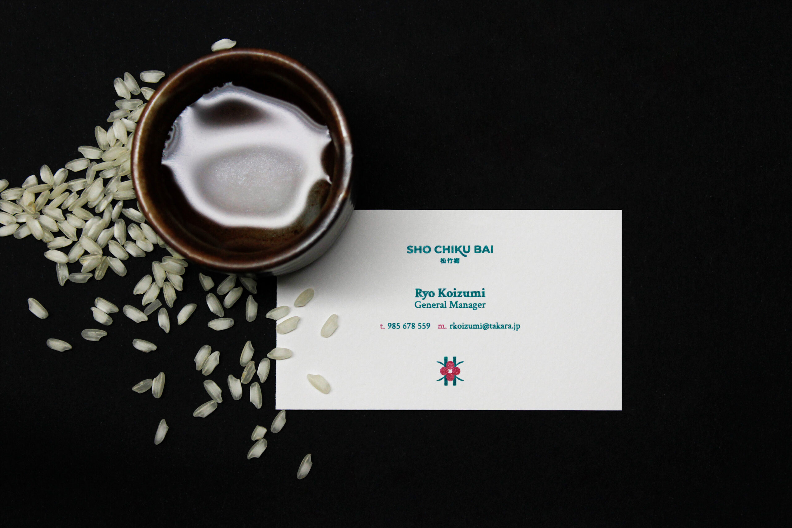
Takara Sake USA Inc® is one of the most recognized corporations and producers at the level of distribution of alcoholic beverages mainly throughout the Americas region.
That is why the redesign was mainly carried out bilingual in English and Japanese, with the Japanese country being the home of recognition for the brand.